
Gooru: Birth of a Brand
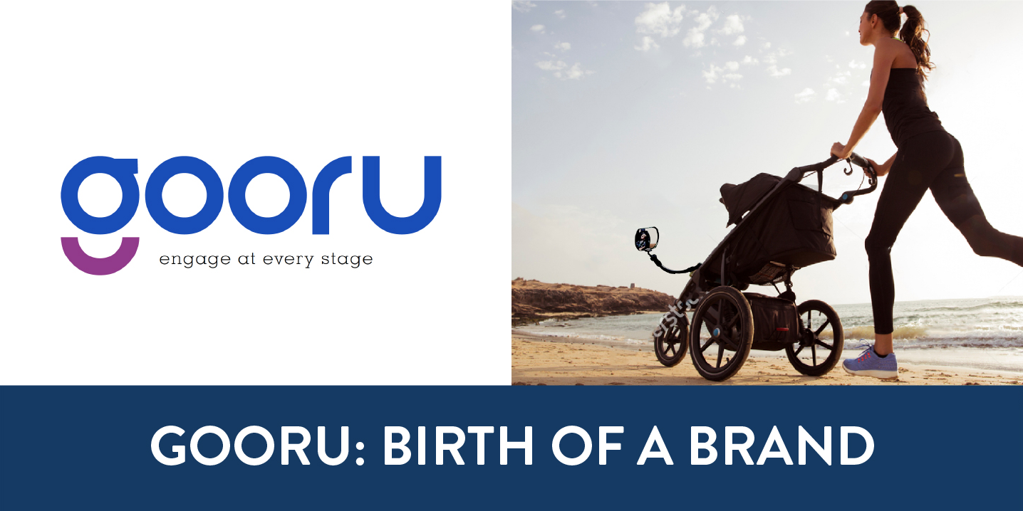
They say necessity is the mother of invention, and Puck Fernsten’s story seems to illustrate this adage perfectly. A new dad and loving the outdoors he found himself out and about town pushing his little one around in a stroller. Either walking or jogging, both enjoyed the outdoors. While his baby was forward facing, Puck could not see them and vice versa. It seemed a wasted opportunity for interaction with his son, when a light bulb went off, or should I say, went on. Puck soon found himself tinkering around in his garage jury-rigging a mirror on the front of the stroller so that he could see his son and the baby could see him. Fast forward to where Fuzion entered into play. Puck approached us in the middle of product development needing branding help to launch the brand and bring his vision to life. He needed a brand name, tagline, and packaging for his new mirror concept. Logically the name needed to come first. Concentrating on names that would emphasize learning and interaction, Fuzion held a name storm and Gooru was born. The name embodies his visionary goals while at the same time retaining a cute and memorable feel, and most importantly it was available. As anyone who has tried to come up with a product or company name knows, the good ones always seem to be taken. We also brainstormed a perfect tagline for the brand: “engage at every stage”.
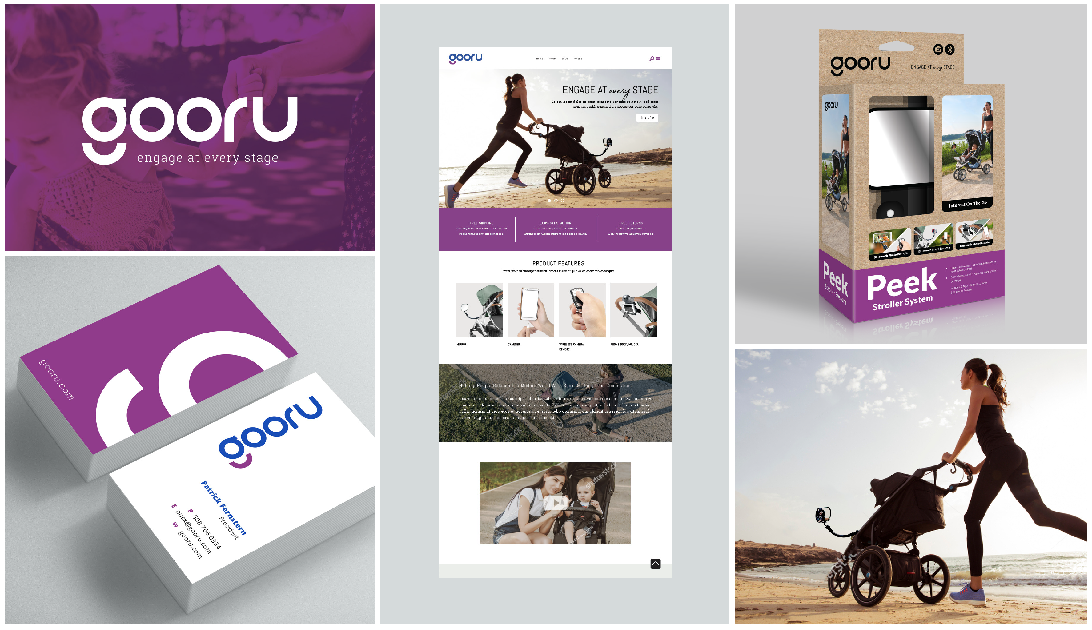
Onto research, logo development and brand look. Fuzion researched in the competitive arena both at retail and the Internet level looking at trends in the juvenile and sporting space. Combining the research with an understanding of the client’s vision for his new brand, we moved onto design.
![]()
![]()
![]()
Focusing on a clean contemporary design look that worked with the playful Gooru name, we got to work. After looking at several designs the chosen logo had a decidedly fun look with a lower-case “g” that stood by itself as an icon and recalled the essence of a smile. We moved on to the business card, packaging, and mocked up a homepage for the website. The package utilized the purple and blue from the logo and had a clean contemporary look.
![0FF83F2F-6939-4C27-908D-3E0ACF9A9015[2]](http://fuziondesign.com/wp-content/uploads/2020/10/0FF83F2F-6939-4C27-908D-3E0ACF9A90152-1.jpeg) Puck’s daughter with the finished product and displaying the Favorite Product Award for Mass Innovations.
Puck’s daughter with the finished product and displaying the Favorite Product Award for Mass Innovations.
Puck was thrilled with his new brand line look that created a professional, finished look and enabled him to start the selling process.
Need help with launching your brand? Contact us at: info@fuziondesign.com