Celebrating 10 Years!
It has been 10 years since Fuzion opened its doors in 2008 (in hindsight, probably not the best year to start a business). While the timing may have not been ideal, Fuzion has managed to persevere and thrive through the years and are excited to be celebrating our 10th anniversary.
Starting out in a 1500-square-foot office, which seemed way too big. Wayne remembers it seemed like two BBs rolling around in a boxcar. But before you could say Jiminy Cricket, we outgrew the space at 150 Main Street, and in 2012 moved to a spectacular new 4,500-square-foot space in the Design Exchange building at 161 Exchange St., practically a stone’s throw from the former office. Hundreds of projects later, we are still producing award winning branding solutions for a wide variety of clientele.
To celebrate, we are going to take you on a stroll down memory lane to show you some of our most memorable and successful projects at Fuzion to date. Have a favorite? We would love to hear about it.
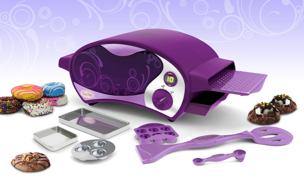
1) Easy-Bake
Easy-Bake Oven is easily our most famous project to date. The biggest challenges for this iconic toy makeover were to eliminate the light bulb, which was the heating element, and to design a modern new look that would feel at home on the counter in today’s modern kitchens. After hours and hours of research and probably 3 dozen design iterations, Fuzion knocked it out of the ballpark. When the Easy-Bake Oven was launched, it became one of the top 10 selling holiday toys that year, and continues to be on the wish list for aspiring chefs!
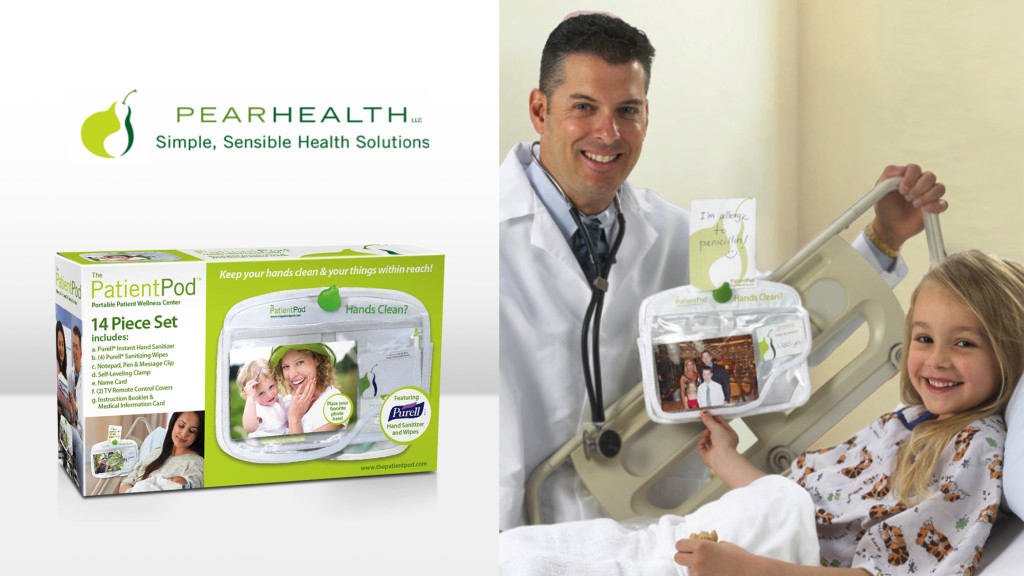
2) PearHealth
The PatientPod was Fuzion’s first foray into the burgeoning healthcare market. Our client, Pat Mastors, saw the need for a product that could help prevent the spread of pathogens after her father became a victim of MRSA during a routine hospital visit. Fuzion helped her design and brand the PatientPod portable wellness center. It easily clipped on a bed rail, IV pole or even a wheel chair, reducing fall risk, helping prevent the spread of pathogens, eliminate lost patient items and reduce harm during care.
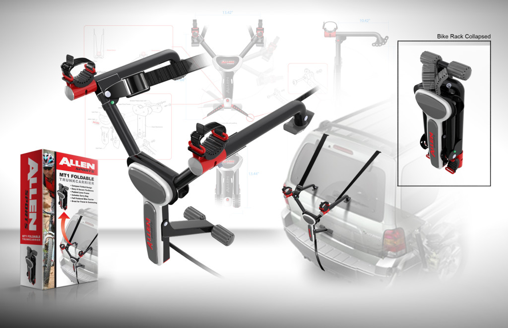
3) Allen Bike Rack
Good things do come in small packages! The owner of Allen Sports came to Fuzion with a cardboard mockup for a compact foldable bike rack. After trial and tribulation, and some Fuzion engineering, the Allen Sports One Bike Compact Folding Bike Rack was born! It even came with a carrying tote bag that could fit into your backpack. When launched at Walmart, it soon became a top seller. Fuzion went on to develop several variations, including a 2-bike rack and a lightweight aluminum rack.
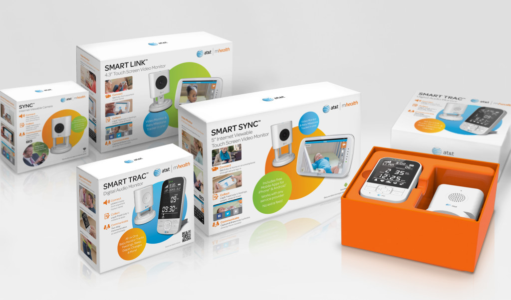
4) AT&T
The challenge for Fuzion on this very high-end line of baby monitors was that AT&T had never made the foray into baby products. The big question was how do you take a line look designed exclusively for tech products and make it work amongst a sea of baby monitors. Luckily, Fuzion was up for the challenge and persevered with a look that was clean with concise information and lifestyle photography that warmed the line look and helped tell the story of these high-tech baby monitors. Chalk another award-winning branding to Fuzion!
5) Candylicious
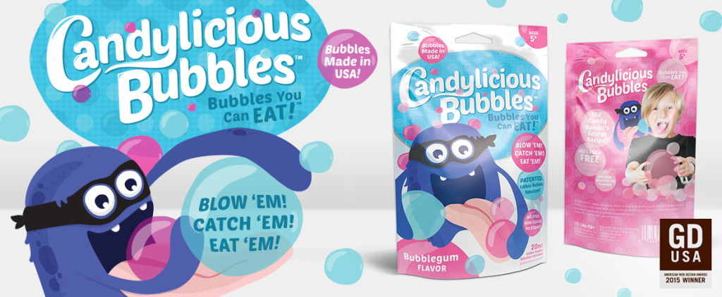
Who wouldn’t want to eat a bubble? Especially if it tasted like tutti frutti or bubble gum! Little Kids, a local manufacturer of toys for kids of all ages, with a knack for all that is bubbles, posed that question to Fuzion with their new edible bubble line, “Candylicious.” Fuzion not only developed a playful and colorful logo and line look, but also helped bring the iconic Candy Bandit character to life. Candylicious was a huge success when launched at Toy Fair in 2015 and won a prestigious American Graphic Design Award for packaging in 2015.
6) SmartSheer
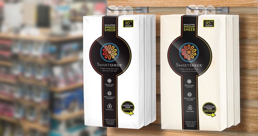
Smart Textiles Inc. needed to launch a new sheer drape line. Though stylish and unassuming, these patented sheers had insulation qualities comparable to polystyrene insulation and would save on energy bills. The challenge was to quickly communicate the story at retail. After much research, Fuzion designed a brand look that stood out from the competition, utilizing iconography to convey its features. An immediate success at Bed Bath & Beyond, it spawned several lines of window treatment products.
7) Nösh
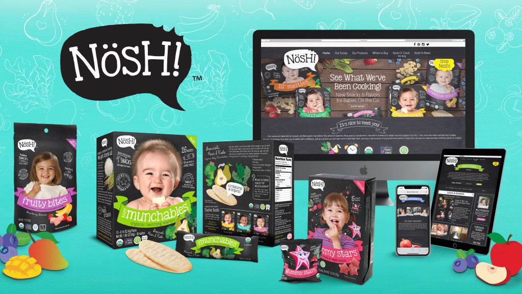
This start-up baby & toddler snack food company engaged Fuzion to create a unique brand story and an eye-catching retail presentation to ensure the successful launch of their new rice crackers in the highly competitive specialty baby and toddler food market. Designed to resemble an established farm fresh organic brand that would attract health-conscious foodie Moms, Nosh Launched in 400 Babies “R” Us in September 2016. Fast forward today, it is now in over 4,000 stores and more than 20 countries. Fuzion has won awards in both branding and website design for this artisanal organic brand.
8) 20 Volt
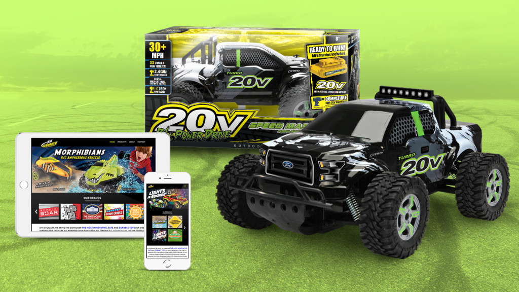
Talk about fast! This 20 Volt RC truck with speed up to 30 MPH, grossed millions in sales for the parent company Kid Galaxy in partial thanks to Fuzion’s ability to tell a story through compelling graphics and package structure. Not only did Fuzion design the brand look, but also designed the graphics for this speedy RC vehicle. A very cool gritty skull graphic and dynamic font treatment helped drive home the differentiating 20V interchangeable battery feature. When launched at a major warehouse club last fall they literally flew off the shelves.
9) Metalform
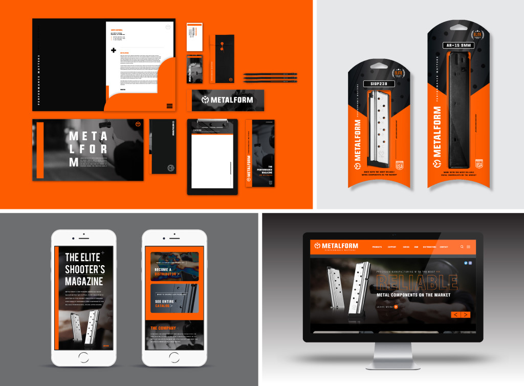
Metalform, a manufacturer of gun magazines who sold to gun manufactures like Smith & Wesson, represented a unique branding challenge for Fuzion. They also sold their own brand, Metalform. Seeing an opportunity in a marketplace full of poorly branded competitors, Metalform decided to invest in marketing. Utilizing our proven brand strategy, Fuzion targeted the uninspired branding of the competitive set and developed a brand look that made Metalform pop off the shelves. The look was debuted at a major trade show (in a booth that was also designed by Fuzion) and sales shot up!
10) Brackitz
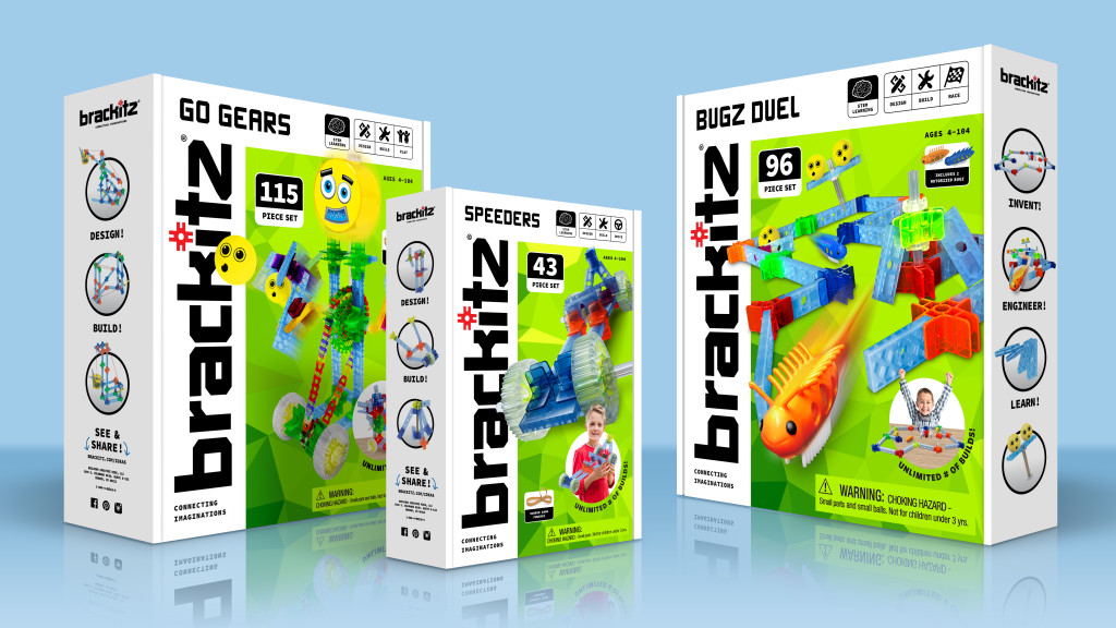
Brackitz is a STEM building system, developed by a dad scientist noticing that his kids wanted to build things that just couldn’t be executed with traditional blocks. After success in the specialty market, they decided to take their package to next level for the big box store arena. Eliminating a window box added real estate for a larger branding presence and a lifestyle image to show scale. A new bold vertical logo and dynamic photography on a bright green field added drama and excitement. The new look was a unanimous success at Hong Kong and NYC toy fair in 2018.


