
Branding Rhode Island’s Smallest City
It’s one of the smallest cities in the US, with its borders totaling 1 square mile and is mired with a less than rosy reputation and is one of Rhode Island’s most colorful municipalities. Last spring, Fuzion was fortunate enough to be invited to develop concepts for the branding of this multi-cultural berg. We were excited by the prospect and challenge set before us and accepted with a resounding yes.
Our team was about to get a crash course in CF 101 as it is lovingly referred to by its residents. We began our journey by meeting the Mayor and his staff at City Hall and quickly learned some of the unique challenges set ahead. Soon after, we were escorted on a walking tour and we didn’t have to go far to see some very interesting and historic architecture. Several giant umbrellas festooned Jenks Park which is adjacent to City Hall, as well as the stately Cogswell Memorials Tower, both of which I had never seen before. We lunched at a Colombian restaurant and surprisingly enough (or maybe not surprisingly enough for RI and its smallest city), we ended up at a table right next to the Mayor, who seems to be the hero in this tiny town. After a delicious lunch of traditional Columbian food, we continued our tour, meeting several townspeople along the way. We made an unannounced stop at the local shoe repair shop and we’re welcomed with open arms. Through our tour guide and translator, the owner was eager to share how much in the last few years the city had changed for the better. Smiling from ear to ear, he was literally gushing with pride as he exulted the virtues of living in CF. We completed our tour, stopping at the Fire Station and meeting the Chief who grew up in CF and had no problem rattling off positive changes in the city as well. Commenting on the growing sense of community, the drop in crime and the regentrification of abandoned buildings that had sat vacant for years. In short, the smallest city was on its way back in a big way.
Before we began any design work, we felt it was important to have residents participate in the rebranding, so the city added a short 3 question survey to their weekly newsletter. With one question being “What is your favorite aspect of living in CF”? the response seemed to be an unqualified affirmation of a community that is proud as well as strengthened by its diversity.
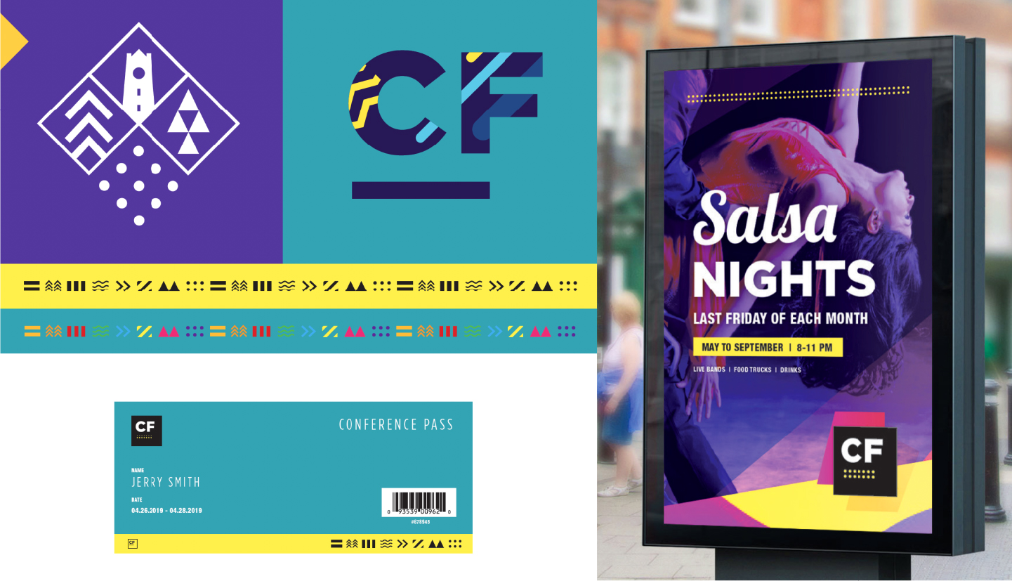
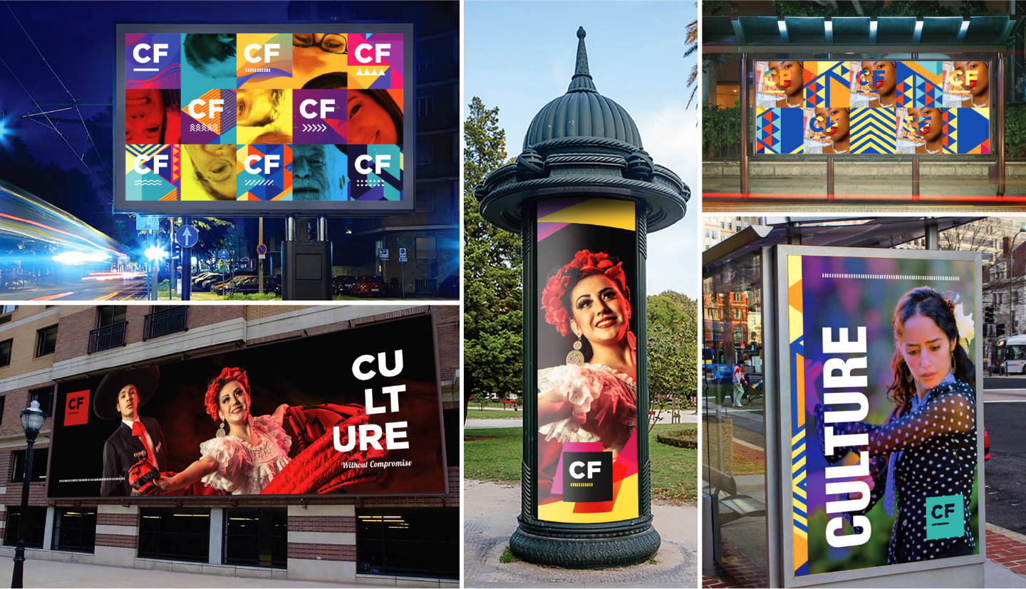
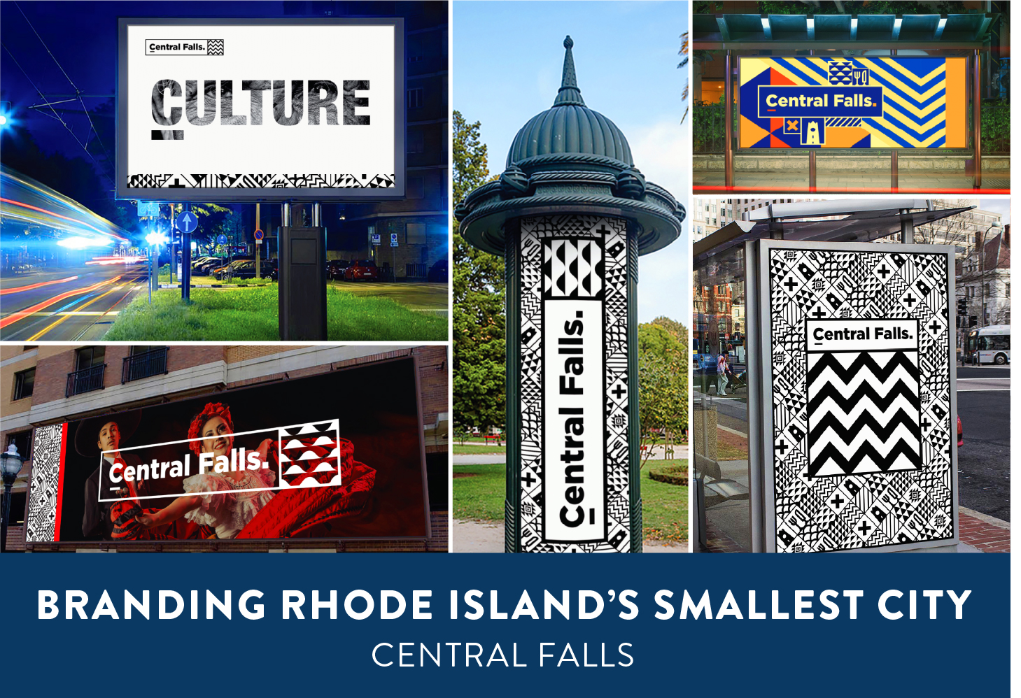
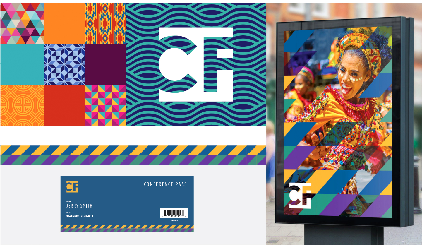
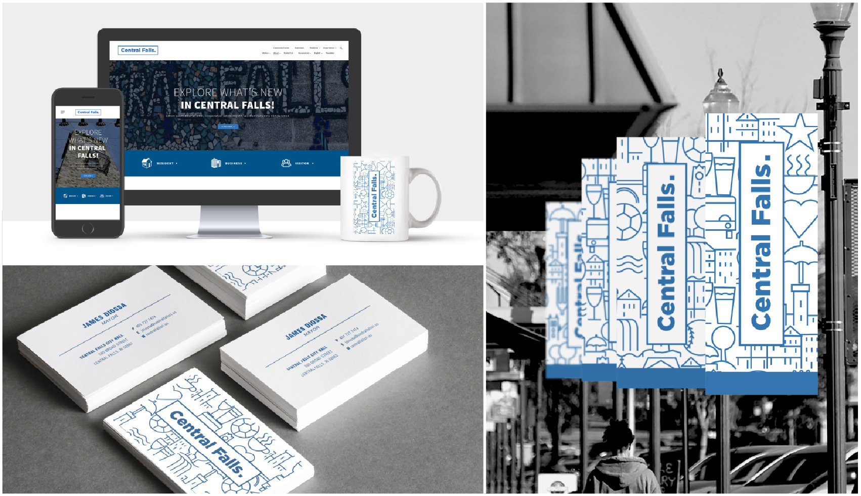
Utilizing the feedback from the survey as well as our own research, and brainstorming we began to move forward with our design exploration. We worked to develop the brand concept it became clear to us that our exploration extended beyond the specific goal of creating a stagnant identity. We needed much more than a single icon, much more than a single logo. The brand needed complexity. It needed life. It needed stories. It needed personality. After all CF is a city with a strong personality. It has a recognizable attitude. The brand must represent more than an entity, or a mere geographic location, restrained by physical boundaries. The City is filled with life, character, with habits and ways of living, with landmarks, landscapes and a very particular culture. CF is alive, and its identity shouldn’t be fixed or closed. It needs to breathe and grow every day.
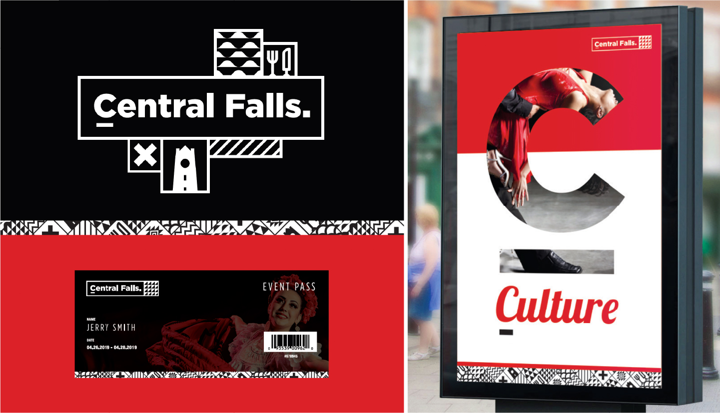

To that end, we worked to design a rich and unique visual language that could be expanded and used in number of ways. Our vision was to design symbols that deliberately embodied a degree of abstractness as to not look like Googled clip art. In essence the brand would become abstract art, changing and growing as the city did. The results were concepts that are colorful, bold and embodied the rich culture of CF. Not only would we utilize a unique visual language, but we felt it was important for photography to play a central role to bring authenticity to the many cultures found within it’s one square mile.
We presented 3 different concepts and we would love to hear your thoughts or comments.
Love love love! Born and raised in CF….so many changes over the years but happy to see the energy and enthusiasm of its residents. Kudos to you and your team Wayne for landing the gig and coming up with these terrific concepts. Jenks Park Tower – gotta include the tower in the brand. It defines what has never changed in CF.
Hi Sandy,
So glad that you liked our branding. Unfortunately, what we didn’t mention is that they had no funds to move forward with it. Smallest and poorest city. : (. Hopefully they will be able to move forward soon.
Looking forward to Bloody Mary’s on you bought this summer!
Best,
Wayne