
Who doesn’t love a new look?
With the recent and exciting changes at Fuzion, we’ve decided to give ourselves a fresh new look. Everyone needs to upgrade and change things up a bit at some point. Just think back to your own style back in Middle School and you’ll quickly realize that rebranding is necessary!
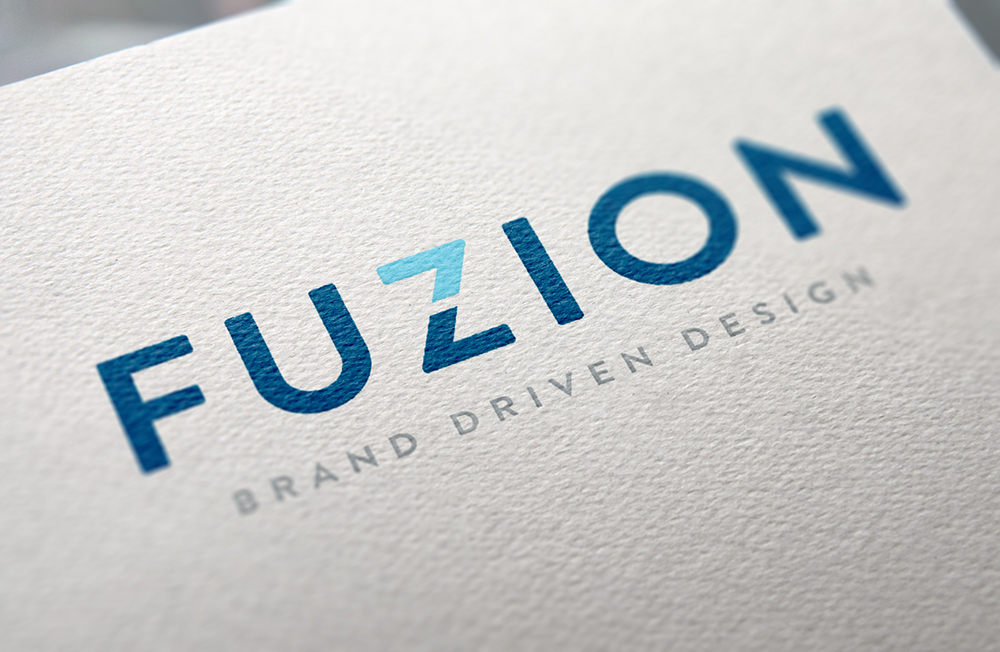
We are proud to present the new Fuzion logo. Take it all in! Isn’t it a beauty? When coming up with this logo, we wanted something clean and contemporary. The two shades of contrasting blue gives off an exciting pop, while bringing in an air of sharp sophistication. The ‘Z’ itself has become more versatile as it can be used as an icon and as a pattern in the future.
We dropped the word ‘Design’ from this logo because we wanted to show that we offer much more than just design. We are evolving, which is really the focus of this rebranding. Rebranding is a necessity for all businesses to grow and keep up with the times. We’re already known for our stellar work with toys and packaging, but we also wanted to show that we are diving deeper into new markets like strategy and branding as we move forward.
Nobody wants to look stale and outdated, and things move so fast these days that keeping up is key so you don’t get lost in the shuffle. We believe that this new look will get our message across of how we have evolved over the years.